A Brief History of Data Visualization: From Maps to BI

The evolution of data visualization is a fascinating journey that spans centuries, beginning with the earliest maps that guided explorers and traders, to the sophisticated business intelligence (BI) tools used today. Initially, data visualization was largely confined to geographical representations, serving as essential tools for navigation and territorial claims. However, as the need to represent more abstract forms of data grew, so too did the methods and techniques for visualizing this information.
This evolution has been driven by the growing complexity of the data itself, as well as advancements in technology, from hand-drawn maps to computer-generated graphs and interactive dashboards. Understanding this progression not only highlights the innovative milestones achieved over time but also underscores the ongoing importance of visualization in making data comprehensible and actionable in the modern world.
Early Beginnings: Data Visualization in Maps
Prior to the 17th century, data visualization existed mainly in the realm of maps, displaying land markers, cities, roads, and resources. Maps were essential tools for explorers, merchants, and governments, as they provided critical information for navigation, trade, and territorial claims. As exploration expanded and the demand grew for more accurate mapping and physical measurement, better visualizations were needed. These early maps were often hand-drawn and meticulously detailed, reflecting the best available knowledge of the time.
The 17th Century: The Dawn of Statistical Visualization
The 17th century marked the dawn of statistical visualization, a pivotal moment when the representation of abstract data began to take shape. Michael Florent Van Langren’s pioneering work in 1644 introduced the concept of using graphical tools to convey complex information, moving beyond traditional tables and text.
This period saw the initial steps towards understanding how data could be visualized to reveal patterns, relationships, and insights that might otherwise remain hidden. Van Langren’s line graph, which depicted varying estimates of longitude, set the stage for future innovations in data visualization, demonstrating the power of visual representation in making data more accessible and comprehensible.
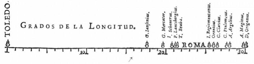
Michael Florent Van Langren and the First Statistical Graph
In 1644, Michael Florent Van Langren, a Flemish astronomer, is believed to have provided the first visual representation of statistical data. This marked a significant shift from purely geographical maps to the visualization of abstract data. The one-dimensional line graph below shows the twelve known estimates at the time of the difference in longitude between Toledo and Rome, as well as the name of each astronomer who provided the estimate.
What is notable here is that while Van Langren could have provided this information in a table, it is the use of the graph that really visually displays the wide variations in estimates. This early attempt at data visualization demonstrated the power of graphical representation to convey complex information more intuitively than tables or text.
The 18th Century: The Rise of Thematic Mapping
The rise of thematic mapping in the 18th century marked a significant evolution in the field of cartography and data visualization. This era introduced maps that went beyond merely depicting geographical features, focusing instead on specific themes such as population density, economic activity, and health statistics.
These thematic maps allowed for a more targeted analysis of various social, economic, and scientific phenomena, providing insights that were previously difficult to visualize. This shift in focus from geography to themes laid the foundation for the development of modern statistical maps and graphs, which would become crucial tools in data analysis and decision-making in the centuries to come.
Thematic Mapping and Early Graphs
The 18th century saw the beginning of thematic mapping. Thematic maps differ from traditional maps in that they focus on specific themes or topics, such as population density, economic activity, or health statistics, rather than geographic features. Attempts at the thematic mapping of geologic, economic, and medical data were made near the end of the century. Abstract graphs of functions, measurement error, and the collection of empirical data were introduced at this time, laying the groundwork for the more sophisticated visualizations that would follow.
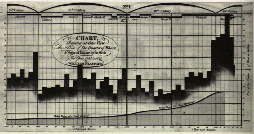
William Playfair: The Father of Modern Statistical Graphs
This period also gave us William Playfair, who is widely considered to be the inventor of many of the most popular graphs we use today, including line, bar, circle, and pie charts. Playfair’s work was groundbreaking because it introduced the concept of visualizing economic and social data to reveal trends and patterns that were not immediately apparent in numerical form.
Many statistical chart types, including histograms, time series plots, contour plots, scatterplots, and others were invented during this period. A graph by Playfair (1821), shown below, displays the price of wheat, weekly wages, and reigning monarch over a two hundred fifty-year span from 1565 to 1820. This visualization was not only informative but also allowed users to quickly grasp the relationship between different variables over time.
The 19th Century: The Golden Age of Statistical Graphics
The latter half of the 19th century is what Friendly calls the Golden Age of statistical graphics. This era was marked by significant advancements in both the theory and practice of data visualization.
John Snow and the Cholera Map
Two famous examples of data visualization from that era include John Snow’s (not that Jon Snow!) map of cholera outbreaks in the London epidemic of 1854. This map was revolutionary in its ability to identify the source of the cholera outbreak, demonstrating the power of data visualization in public health.
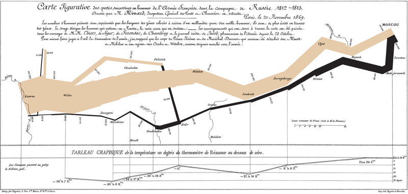
Charles Minard’s Chart of Napoleon’s Russian Campaign
Another iconic visualization is Charles Minard’s 1869 chart showing the number of men in Napoleon’s 1812 infamous Russian campaign army, with army location indicated by the X-axis, and extreme cold temperatures indicated at points when frostbite took a fatal toll. This visualization is celebrated for its ability to convey multiple dimensions of data in a single, powerful image.

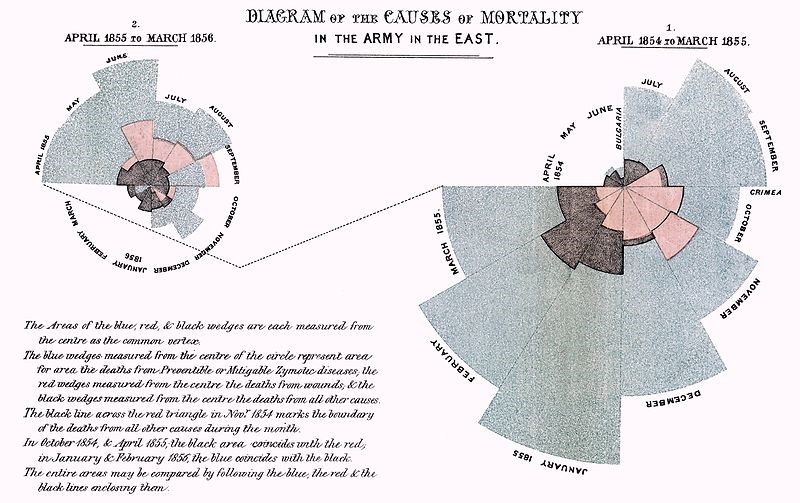
Florence Nightingale and the Rose Chart
This time also provided us with a new visualization, the Rose Chart, created by Florence Nightingale. Nightingale’s Rose Chart, also known as the Coxcomb Chart, was used to illustrate the causes of mortality in the army during the Crimean War. Her innovative use of data visualization helped to convey the impact of poor sanitary conditions on soldier mortality rates, leading to reforms in military and public health practices.
Factors Contributing to the Golden Age
A number of factors contributed to this “Golden Age” of statistical graphing: the industrial revolution, which created the modern business; official government statistical offices, to support an increasingly aware and global populace; and a growing recognition of the importance of numerical data in social planning, medicine, military, industrialization, commerce, and transportation. Statistical Theory also provided the means to make sense of large datasets, allowing for more accurate and insightful visualizations.
The Modern Dark Ages of Data Visualization
The “Modern Dark Ages” of data visualization was a period where the progress in developing new visualization techniques slowed, largely due to the statistical community’s preference for precision over interpretative visual methods. During this time, while innovation in visualization was limited, the tools and techniques from the previous century became more standardized and widely adopted in textbooks, business reports, and government documents. This era set the stage for the later resurgence of data visualization by embedding these methods into mainstream use, even as they fell out of favor in more specialized academic and statistical circles.
The Early 20th Century: A Shift Away from Visualization
The growing trend towards statistical visualizations hit a small roadblock in the early 20th century. Friendly describes this era as the modern dark ages for data visualization. Statisticians were increasingly concerned with exact numbers and considered images to be overly inaccurate. While innovation in the field may have indeed veered away from data visualizations, this period saw a growth of data visualization in the public consciousness. Charts and graphs of various sorts were rapidly becoming adopted into textbooks, business applications, science, and government. This shift laid the foundation for the widespread use of visualizations in everyday communication, from newspapers to corporate reports.
The Role of Cognitive Psychology
[Editor’s Note: While statisticians gave data visualization the cold shoulder during this era, the first half of the 20th century also brought psychology forward as a science; in particular, the development of cognitive psychology and the study of human perception has provided a much better understanding of how the brain interprets information and recognizes patterns. This research has been instrumental in developing and refining the science of data visualization best practices.]
The Rebirth of Data Visualization
The “Rebirth of Data Visualization” was characterized by a dramatic resurgence in the field, driven by the advent of computer technology. With the ability to process and analyze vast amounts of data quickly, computers transformed how data was visualized, allowing for more sophisticated and complex representations than ever before.
This period saw the revival of interest in graphical methods, not just as tools for data exploration but also as essential elements in communicating insights. The increasing accessibility of computing power democratized data visualization, enabling more people across various industries to create and use visual tools, paving the way for the modern era of data-driven decision-making.
The Late 20th Century: The Computer Age
The latter half of the 20th century is what Friendly calls the ‘rebirth of data visualization,’ brought on by the emergence of computer processing. Computers gave statisticians the ability to collect and store data in increasingly larger volumes, as well as the ability to visualize the information quickly and easily.
Pioneers of Modern Data Visualization
The 1960s and 1970s saw the emergence of researchers like John W. Tukey in the United States and Jacques Bertin in France, who developed the science of information visualization in the areas of statistics and cartography, respectively. Their contributions laid the groundwork for modern data visualization techniques, which integrate statistical rigor with the power of visual communication.
Edward Tufte and the Visual Display of Quantitative Information
The early 80s saw the emergence of Edward Tufte, whose seminal work, The Visual Display of Quantitative Information is still used today in university courses for data visualization and statistical analysis. Tufte also introduced us to the sparkline, which gives the general shape of a trend in a small amount of space, allowing for dense information to be conveyed at a glance.
The Explosion of Data Visualization in the Modern Era
The last three decades have seen the field of data visualization explode into dozens and even hundreds of focus areas. The advent of big data, artificial intelligence, and machine learning has further expanded the possibilities for data visualization.
Modern Tools and Techniques
Dashboards and data discovery tools, scorecard applications, analytics suites, and an assortment of other software tools enable businesses, researchers, and individuals to explore their data in new and increasingly imaginative ways. Interactive visualizations, augmented reality, and virtual reality are now being integrated into data visualization practices, offering immersive experiences that go beyond traditional charts and graphs.
Notable Modern Contributors
Notable writers and educators in the modern era, including Alberto Cairo, Stephen Few, and Colin Ware, continue to refine the science and art of data visualization and bring it to new heights, pushing the boundaries of what can be achieved through effective visual communication.
The Future of Data Visualization
Challenges and Opportunities in the Information Age
We live in an exciting yet challenging time for data visualization. Even as we discover new ways to collect, aggregate, analyze, and visualize data, we are also discovering some new and important societal challenges regarding the violation of privacy and the potential misuse of data – both intentional and unintentional. The ethical implications of data visualization are becoming increasingly important, as the ability to manipulate and misrepresent data grows with technological advancements.
Looking Forward
As we enter the information age, it’s both exciting and terrifying to imagine what the future holds in store for us, both as individuals and as a society. Randy Bachman said it best: We ain’t seen nothin’ yet!