A Quick Guide to Embedded Dashboards

Understanding embedded analytics dashboards starts with knowing what the term itself means—so let’s break it down. Dashboards are screens or pages that display information in a unified view that makes data easily digestible for end users.
What Are Embedded Dashboards?
Embedded dashboards are screens that display data and analytics within existing business applications. Think of the analytics dashboards and reports you might see in your usual business applications (Salesforce, Google Analytics, etc.) or consumer applications (Fitbit, your personal banking app, etc.). Unlike standalone analytics platforms, Embedded Dashboards provide seamless access to real-time information within the systems users interact with daily. By embedding these dashboards, organizations enhance the user experience and promote data-driven decisions, making analytics more accessible and relevant to specific business needs.
Embedded dashboards may display data such as:
- Business reports related to financials, productivity, or other key metrics
- Workflow visualizations
- Personal notifications
Embedded dashboards provide value to end users by distilling large datasets into actionable information and presenting the information in the context of tools they already use every day.
How Embedded Dashboards Work
Embedded Dashboards work by embedding data visualizations and analytics tools into existing applications or systems. They’re usually powered by an underlying analytics platform and connected through APIs, allowing the dashboard to pull real-time data directly from various data sources. These dashboards can be customized to match the look and feel of the host application, ensuring consistency. When users interact with Embedded Dashboards, they can access data insights immediately within their primary tool, streamlining decision-making without switching between systems.
Why Embedded Dashboards are Important
Embedded Dashboards are important because they make data more accessible, allowing users to make informed decisions without leaving their main application. By integrating dashboards within core business tools, organizations foster a culture of data-driven decision-making, reduce workflow disruptions, and improve efficiency. Embedded Dashboards also provide users with contextual insights, as they can view relevant data in the same environment where decisions are made, leading to faster, more impactful actions.
Key Components of Embedded Dashboards
- Data Connectivity: Embedded Dashboards rely on strong data connectivity to pull real-time information from multiple sources.
- Customizable Design: The dashboards are designed to match the host application’s interface, ensuring a seamless user experience.
- Interactivity: Users can interact with data through filtering, sorting, and drilling down into specific metrics within the dashboard.
- Security Controls: Embedded Dashboards include robust security measures to ensure that sensitive data is protected within the host application.
- Integration via API: APIs are critical for connecting the dashboard to data sources and ensuring smooth data flow within the embedded environment.
Benefits of Embedded Dashboards
Embedded Dashboards provide significant benefits, including improved accessibility, better user engagement, and increased productivity. Since data insights are embedded within the tools users rely on, they can access information faster, leading to quicker decision-making. Embedded Dashboards also allow for a tailored experience, where dashboards are customized to meet the unique needs of each department or role. This integration reduces time spent switching between platforms, ultimately enhancing workflow efficiency and promoting a data-driven culture within the organization.
Key Challenges of Embedded Dashboards
Implementing Embedded Dashboards can present challenges, including technical integration, data security, and user training. Technical integration can be complex, especially when connecting multiple data sources through APIs, requiring a stable infrastructure to support data flow. Data security is also critical, as organizations need to ensure that sensitive information remains protected within the host application. Additionally, user training may be necessary to help employees navigate the new embedded features effectively, ensuring they can leverage insights without confusion.
Best Practices for Embedded Dashboards
- Align Dashboards with User Needs: Ensure that Embedded Dashboards are customized for specific roles or departments to maximize relevance and impact.
- Focus on Usability: Design dashboards to be intuitive and easy to navigate, enhancing user experience within the host application.
- Prioritize Data Security: Implement strong data protection protocols, including access controls, to secure sensitive information within the embedded environment.
- Leverage Real-Time Data: Embed real-time data to provide users with the most current insights, enhancing the value of the dashboard for decision-making.
- Optimize Performance: Test and optimize Embedded Dashboards for speed and performance, ensuring that they do not slow down the host application or disrupt workflow.
Popular Data Visualizations in Embedded Dashboards
Data can be represented visually in a variety of ways in an embedded dashboard. Below are some of the most common data visualizations used in embedded dashboards:
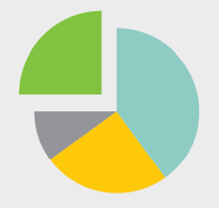
Pie Chart
Illustrates a parts-to-whole comparison between disparate datasets, with each wedge of the pie representing a percentage or magnitude. In pie charts, each slice is proportional to the category it represents, allowing viewers to quickly understand the relative size or importance of each segment within the whole. By visualizing data in this way, pie charts make it easier to compare individual parts in relation to the total dataset. Pie charts are especially useful for showcasing data distributions, percentages, or contributions, making them a popular choice for illustrating market share, budget allocations, and demographic breakdowns.
Scatter Chart
Shows how two continuous variables relate to one another—answering the question “Are these two metrics related in some interesting way?”—and can be used to indicate correlation patterns in data. In a scatter chart, each point represents an observation, with its position determined by values on both the x and y axes. This format makes it easy to spot trends, clusters, or outliers, highlighting whether a relationship exists between the variables. Scatter charts are particularly useful for identifying linear or nonlinear correlations and assessing the strength of relationships, often used in fields like finance, sales, and research to explore dependencies, forecast trends, or test hypotheses.
Bubble Chart

Similar to scatter charts, a bubble chart is a way to show multivariate data. Bubble charts display three variables, breaking entities down by their relative values, positions, and size. In this format, two of the variables are represented on the x and y axes, while a third variable is indicated by the size of each bubble. This approach enables viewers to see how multiple variables interact at once, making bubble charts ideal for visualizing complex datasets with an added dimension of comparison. Often used in finance, marketing, and project management, bubble charts can illustrate data like revenue (size of bubble) versus time and cost (x and y axes), allowing patterns and clusters to emerge and providing a richer context for decision-making.
Whisker Chart
Illustrates the distribution of a dataset vertically using boxes known as whiskers. Whisker charts, often called box-and-whisker plots, display the spread and variability of data by marking the minimum, first quartile, median, third quartile, and maximum values. The “box” represents the interquartile range (IQR), highlighting where the bulk of the data points lie, while the “whiskers” extend to show the range of the dataset. Whisker charts are useful for identifying outliers, comparing distributions across groups, and visualizing data skewness, making them commonly used in fields like statistics, finance, and research to understand data spread and central tendency.
Polar Chart
Displays cyclic data—for example, number of sales each month—in the form of a two-dimensional chart. Polar charts arrange data around a central point, with each data point positioned based on its angle and distance from the center. This format is especially useful for visualizing trends that repeat over time, such as seasonal patterns, daily temperature variations, or monthly sales figures. By showing data in a circular layout, polar charts make it easy to spot peaks, dips, and periodic fluctuations, making them ideal for data that naturally follows a cyclical or radial pattern.
Gauge
Illustrates where a point-value KPI falls against a target range. Gauge charts, often shaped like a speedometer, provide a visual representation of performance relative to defined thresholds or goals. The gauge displays a single value on a scale, making it easy to see if a KPI is within an acceptable range, approaching a target, or falling short. Commonly used in performance dashboards, gauge charts are effective for tracking metrics such as progress toward sales goals, customer satisfaction scores, or production output, allowing viewers to quickly assess how well an indicator aligns with objectives.
Area Chart
Displays cumulated totals using numbers or percentages over time. Area charts use filled areas under a line to represent cumulative data, making it easy to visualize changes in totals across a timeline. Each area represents a portion of the total, with the height at any point indicating the sum of values up to that point. Area charts are particularly useful for illustrating trends, growth, and proportional contributions over time, such as revenue accumulation, population growth, or market share. By layering multiple data series, area charts also highlight how different segments contribute to the overall total, allowing for a clear view of both individual and combined trends.
Funnel Chart

Plots one continuous variable against a categorical value, illustrating stages in a process and displaying potential gaps in that process. Funnel charts are designed to show progression through sequential stages, such as a sales or conversion process, where each stage represents a step from start to finish. While they may not always appear funnel-shaped, as each stage’s width reflects the quantity passing through, funnel charts are ideal for spotting drop-offs, bottlenecks, and inefficiencies. Commonly used in sales and marketing, funnel charts help visualize customer journeys, lead conversions, or any process with a clear sequence, making it easy to assess where improvements can increase completion rates.
The Definitive Guide to Dashboard Design
Download NowHow to Design Embedded Dashboards
Whether you’re designing dashboards from scratch or leveraging a third-party analytics platform to create them, you should keep a few critical best practices in mind as well as board reports best practices. These tips for designing embedded dashboards fall into a few categories:
Content
- Only display the content most relevant to the end user who will be viewing a particular dashboard. You can use show modes and conditions to hide content that doesn’t need to be seen by different users.
- Avoid obscuring important content by overdesigning with distracting visual effects such as background gradients or shadows.
- Use iconography instead of captions or other text. This saves space and improves the user experience by denoting common actions like close or delete.
Layout
- Group related data close together to help focus the user’s attention on critical information.
- Avoid distractions by keeping design elements roughly the same size.
- Limit the amount of data included on a given screen to avoid overcrowding.
Color
- Use dashboard color schemes with a few different colors that are each different enough from the others to avoid confusion.
- Use bright colors (e.g. yellow or red) when you want a particular design element or piece of content to “pop” and draw the user’s immediate attention.
- Keep meaning in mind. A user’s brain may associate red with “stop” and green with “go,” so ensure that the dashboard colors you choose align with the desired connotations.
Font
- Stick to a single font type to avoid confusing the user.
- Limit a dashboard to three font sizes max to create a clear yet simple visual hierarchy.
- Use bold fonts sparingly and only to highlight category headers or important content.
17 Dashboard Design Tips for Non-Designers
Download NowUsing Embedded Dashboards to Visualize Data
Companies can use analytics dashboards and reports to visualize important data to help in the decision-making process. Whether they decide to build or buy the software to customize their OEM embedded dashboards depends on their customer’s needs and what makes the most sense for the business. Check out a free demo of our embedded analytics platform to see how you can build custom executive dashboards quickly and easily to visualize data.