Visualizing for the Color Blind
Color blind data visualization plays a critical role in ensuring that all users, regardless of their ability to perceive colors, can effectively interpret and engage with visual data. By thoughtfully designing visualizations that accommodate color blindness, organizations can enhance accessibility and inclusivity, making their data-driven insights more universally understandable.
What is Color Blind Data Visualization?
Color blind data visualization refers to the practice of designing charts, graphs, and other visual representations of data in a way that ensures they are accessible to individuals with color vision deficiencies. Approximately 8% of men and 0.5% of women worldwide have some form of color blindness, which can make it challenging for them to distinguish between certain colors. By adopting strategies that take these limitations into account, data visualizations can be made clear and effective for everyone, regardless of their color perception.
How Does Color Blind Data Visualization Work?
Color blind data visualization works by utilizing design techniques and color palettes that are easily distinguishable for individuals with various types of color blindness. This often involves avoiding color combinations that are commonly problematic, such as red-green or blue-yellow pairings, and instead using patterns, textures, or shapes to differentiate data points. Designers may also use software tools that simulate color blindness to test how their visualizations will appear to users with color vision deficiencies, ensuring that the final product is accessible.
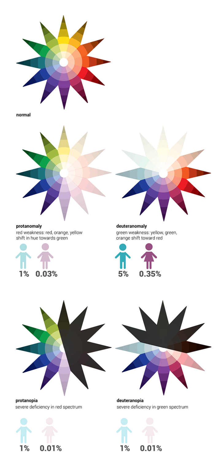
You have three different types of cones in your retina: red, green and blue. Most people affected with color blindness are missing one or more of these cones or have them malfunctioning, which means that they may not be able to distinguish between certain pairs of colors in the same way someone with all three functioning cones can. Color blindness comes in three types:
- Protanopia/protanomaly (missing or malfunctioning red photoreceptors)
- The inability to perceive red or a reduced sensitivity to it, making purple seem blue
- Deuteranopia/deuteranomaly (missing or malfunctioning green photoreceptors)
- The inability to perceive green or a reduced sensitivity to it, making green seem brown
- Tritanopia/tritanomaly (missing or malfunctioning blue photoreceptors)
- The inability to perceive blue or a reduced sensitivity to it, making yellow seem red
Red and green color blindness (deuteranomaly & protanomaly) are by far the most common and are usually grouped together because people with these deficiencies see color in a very similar way. Blue-yellow color blindness (tritanomaly) is extremely rare, affecting less than 0.01% of all color blind people.
When designing dashboards, one of the most important factors for communicating information is color. Color has four characteristics:
- Hue: the color itself
- Lightness: how light or dark the color is
- Saturation: the amount of hue applied to an area, ranging from pale to saturation
- Intensity: how both lightness and saturation are manipulated
In relation to how a color blind user may see the characteristics of color, it’s important to keep in mind what you can do to make your visualizations more accessible to the color blind.
• Hue: Color blindness is essentially an inability to distinguish between different hues of equal intensity. A red-green color blind person may have issues distinguishing red, green, brown, orange and yellow, and will generally confuse blue and purple hues. Blue-yellow color blind people have trouble distinguishing between violet and red, seeing both in a duller hue; blue and green, which will appear as red or blue; and blue and yellow.
• Intensity: since a color blind person can easily distinguish between different intensities, color blind people struggle most when there is no intensity variation in what they are looking at.
• Proximity: the color blind are affected the most when similar colors are grouped closely together. A red-green color blind person would unable to distinguish reds and greens on a chart if they were placed close to each other.
• Size: When the size of color-coded objects is small, only a few cone cells can be used for recognition. Colorblind people find it especially difficult to distinguish the colors of thin lines and small symbols. The larger the solid-colored object is, the easier it is for a color blind person to determine its color. The smaller you make an object, the more difficult it is to tell its specific hue.
Why is Color Blind Data Visualization Important?
Color blind data visualization is important because it ensures that critical information is accessible to a broader audience, including those with color vision deficiencies. When data visualizations are not designed with color blindness in mind, a significant portion of the audience may struggle to interpret the information correctly, leading to misunderstandings or missed insights. By prioritizing color blind-friendly design, organizations demonstrate a commitment to inclusivity, improve user experience, and enhance the effectiveness of their communication.
Color Blind Data Visualization Best Practices
To create effective color blind data visualizations, consider the following best practices:
-
Use Color Blind-Friendly Palettes:
- Opt for color schemes specifically designed to be distinguishable by those with color blindness. Tools like ColorBrewer offer pre-designed palettes that are accessible.
-
Incorporate Redundant Cues:
- Use additional visual cues such as patterns, textures, labels, or symbols to differentiate data points, ensuring that color is not the only distinguishing factor.
-
Avoid Problematic Color Combinations:
- Steer clear of color combinations that are challenging for color-blind users, such as red-green, blue-purple, or green-brown. These combinations can be difficult to distinguish for many with color vision deficiencies.
-
Test Visualizations with Color Blindness Simulators:
- Use tools that simulate different types of color blindness to see how your visualizations will appear to affected users. This allows you to make adjustments before finalizing the design.
-
Consider Contrast Ratios:
- Ensure that there is sufficient contrast between colors, not just in terms of hue but also in terms of brightness and saturation. High contrast can make elements more distinguishable.
-
Label Directly On the Graph:
- Whenever possible, label data points directly on the graph instead of relying solely on a color-coded legend. This helps users quickly identify information without needing to differentiate colors.
-
Educate and Advocate:
- Raise awareness within your team or organization about the importance of color blind-friendly design, and advocate for these practices to be integrated into all visual communication efforts.
Color blindness is a color vision deficiency which affects roughly 8% of the North American male population and 0.5% of the female population. So when designing data visualizations and dashboards, it’s important to keep this group of people in mind to make sure they are seeing the same results as everyone else.
Design Recommendations
- Play It Safe: Avoid situations where several color blindness factors come into play. For example, when designing a scatter plot with different color dots, make sure the dots are either large, spaced out, or have a wide range of intensities (light green, dark red). The use of symbols to supplement your color-schemes can also be useful for the color blind.
- Know What Works: Avoid choropleth maps (which show areas shaded in proportion to the measurement being made) with similar-intensity colors. When this is unavoidable (e.g. when dealing with many different colors of similar intensity), use patterned backgrounds or labels to help color blind users distinguish between colors.
- Interactive Highlighting: When using color to indicate a category (e.g. coloring series on a chart), allow users to hover the mouse over the series legend to highlight that series (by increasing the intensity of that series and decreasing the intensity of the others).
- Know the Combos: Avoid using gradient colors to indicate data values, in particular green-red gradients, green-yellow, blue-purple, blue-red, green-light blue, green-brown, pink-white, red-orange, red-brown, or brown-black.
By understanding how color blindness works, as well as following a few simple design guidelines, you should be able to create effective data visualizations that appeal to everyone. More than 8% of your users will thank you!